From what I understand is that, visual studio code has primarily two things to maintain.
The icon theme
The color theme
Icon theme for VSCode
![]()
Things I usually check while selecting an icon theme for my code editor (Actually file tree to be specific).
The icons should look different: So that I can easily distinguish between them like which one is file and which one is folder.
In my opinion, the icons should be colorful. Because, icons are small. With only grayscale color, the more types of icon you have, the higher your brain will struggle in differentiating between them. Color gives you a new layer of information. So in that scenario, your brain will have less effort in finding the right file.
The icon theme should support as many types of files as possible.
I would choose any icon theme satisfying these categories. As Material Icon Theme is most popular, I just chose it.
N.B. For some person, point 2 can become a bit controversial. Some would say, bringing in color in the sidebar may distract you from the actual code while coding. But it doesn’t bother me as I usually close the file explorer tab while coding 😄 .
Color theme for VSCode
When it comes to color theme, there are literally tons and tons of themes to choose from.
I usually do code for a long time. For example, if you seat for a competetive programming contest, you are going to seat in front of the screen for at least 2 hours straight. In those scenarios, people usually prefer a dark theme because it is good for the eye. So I am going to talk about dark themes only.
As there are soooo many themes for VSCode to choose from, lets shorten the list by taking some popular ones. For example, lets just consider themes from developerdrive website.
In the website, they have showed 5 light and 5 dark themes. I am going to consider only 5 dark themes in the page.
Here are the things I look for while choosing a proper theme for me.
The theme should be as much dark as possible. At the same time, the code should have as much contrast to the background as possible.
I usually don’t like a specific color shade because if you stare at the code for a long time, it might make you hallucinate to see that color on places where they aren’t. For reference, check this colormatters website (specially the See red? part).
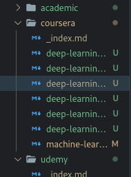
All the components highlighted should be highlighted properly. I am saying this explicitly because, I have seen in many themes the following thing.
Let’s for example take this Aurora X theme and open a file in VSCode. Can you see what the problem is?

Of course, the selected and opened file is highlighted, but if you do not have a high contrast ratio monitor, it would be difficult for you to see.
On the other hand, lets take bear theme. As it is less darker than Aurora X theme, the opened file can be identified very easily.

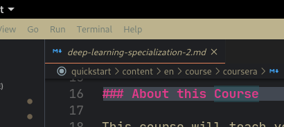
Like the bear theme, One Dark Pro is another theme that satisfies all my requirements. Actually One Dark Pro theme does some things better than bear theme. For example, take a look at the below image of bear theme.

When VSCode is not on focus, the title bar gets some wierd distracting color (I almost thought that this is a bug of the theme). Another problem is, the word match highlighting and markdown header color are very close. This breaks my rule number 3 of choosing a theme.
Finally
At the end, I am still hopping from one theme to another. It is actually to good change and try new themes after one or two weeks. It helps you feel newness to your old project in VSCode.
I am not going to suggest any theme because beauty depends on the eye of the beholder 😉.