Machine Learning Made Easy: Scikit-Learn (Part-2: Unsupervised Learning)
Introduction
Previously, we have understood the core concepts of supervised machine learning and how to use most of the common implementations of many preprocessing techniques, models, etc. with scikit-learn. In this lesson, we will be covering most approaches and techniques used for unsupervised learning using the power of scikit-learn.
The Basics
As a recap, Scikit-learn tries to divide everything related to Machine Learning into the following categories.
Supervised Learning:
a. Classification Problem
b. Regression Problem
Unsupervised Learning
a. Clustering
b. Dimensionality Reduction
c. Density Estimation
Based on these classifications, sklearn has tried a uniform approach for all the data, transformation, preprocessing, and models. In the previous lesson, we have gone through the supervised learning part in this category. In this lesson, we will have a look at unsupervised learning. Let us discuss each of these one by one.
What is unsupervised learning?
According to Wikipedia,
Unsupervised learning (UL) is a type of algorithm that learns patterns from untagged data.
So you will have data, where you do not have any target label to train on. For example, suppose you have 1000 images of cats and dogs, but the images are not labeled as which ones are cats and which ones are dogs. If you then try to create a partition and separate two animals using machine learning methods, that will be called unsupervised learning.
Most people think that unsupervised learning is a little harder than supervised learning. Because it is difficult to determine the loss or goodness of a model as there is no label to compare with. For clustering a dataset, you can use the distance between the mean of two clusters or inverse of distance among points in similar clusters as a goodness of the model. In this lesson, we will go through data clustering, outlier detection, data augmentation, synthesis, and many other unsupervised learning applications.
Clustering a dataset
Clustering is a very if not most popular algorithm definition for unsupervised learning. Clustering is the task of grouping a set of objects in such a way that objects in the same group are more similar to each other than to those in other groups. And each of these groups is called a cluster. For example, suppose you are at a party where everybody is wearing dresses of different colors. Now you are playing a game, where everyone with the same color dress, will come along together. So finally all people wearing red will be together, all persons wearing blue will stand together and same for the other colors. This is called clustering based on the color of each person’s dress.
In the example above, the whole game can a called a clustering algorithm. Here, the similarity between two persons (or objects) is the color. So color is the clustering feature. The difference between the color of two dresses is the distance between two objects while clustering. We could use other clustering features along with the color, for example where each person lives.
There are many clustering algorithms to use when clustering a dataset. We will start with the most common ones and show you how simple it is to implement one using scikit-learn.
Types of clustering
Previously, we have learned everything about K-means clustering. But there are hundreds of more clustering algorithms to use depending on your needs. From the top view, there are two types of clustering that you need to know.
- Divisive Clustering: In this algorithm, we start from only one cluster. At each iteration, we divide clusters to make more clusters. For example, let’s say we have a dataset of 4 points ${A, B, C, D}$. We first divide that dataset into two clusters, ${{A,B}, {C, B}}$. Later, if needed
- Agglomerative Clustering: In agglomerative clustering, we start by assuming each point as its own cluster. So if we have $n$ sample points, then we will start with $n$ clusters. At each iteration, we will merge the two closest clusters into one. Keep in mind that the definition of closest cluster may vary from application to application. But it must follow the Pythagorean distance formula. After some iterations, we will end up in only one cluster.
K-Means Clustering
Mathematically, given a set of observations $(x_1, x_2, …, x_n)$, where each observation is a d-dimensional real vector, k-means clustering aims to partition the $n$ observations into $k (≤ n)$ sets $S = {S_1, S_2, …, S_k}$ so as to minimize the within-cluster sum of squares (i.e. variance). Formally, the objective is to find:
$$arg\ min_s \sum_{i=1}^{k}{\sum_{x \in S_i}{||x - \mu_i||^2}} = arg\ min_s \sum_{i=1}^{k}{|S_i|}\ Var\ S_i$$
where $\mu_i$ is the mean of points in $S_i$. This is equivalent to minimizing the pairwise squared deviations of points in the same cluster:
$$arg\ min_s \sum_{i = 1}^{k}{\frac{1}{2 |S_i|}} \sum_{x,y \in S_i}{||x-y||^2}$$
The equivalence can be deduced from identity:
$$\sum_{x \in S_i}{||x-\mu_i||^2} = \sum_{x \neq y \in S_i}{(x-\mu_i)^T (\mu_i - y)}$$
Because the total variance is constant, this is equivalent to maximizing the sum of squared deviations between points in different clusters (between-cluster sum of squares, BCSS), which follows from the law of total variance.
If you are like me and do not understand anything written above, just see that last equation again and think of our objective to minimize the term with respect to $S$.
The unsupervised k-means algorithm has a loose relationship to the k-nearest neighbor classifier, a popular supervised machine learning technique for classification that is often confused with k-means due to the name.
Here, the term “k-means” means that we will have a total of $k$ points in the feature space. These k points are known as centroids of each cluster. Let’s first implement a K-means clustering from scratch. Our steps will be:
| |
K-Means from scratch
First, we will need a dataset. We will randomly generate a dataset for clustering. Luckily, sklearn gifts us a function named make_blob in its datasets module. This function generates isotropic Gaussian blobs for clustering experimentation.
| |
This will give us a plot of the unclustered dataset retrieved from make_blobs. Visually you can see there are 3 clusters in the dataset.

To cluster this dataset with K-means, we first need to randomly initialize 3 centroid points within the 2D space. We can do this by the following code:
| |
After defining the centroids, we have to calculate the distance of all the points to these centroids. We could use a loop over all the points and calculate the distance manually like below:
| |
But luckily, sklearn provides a convenient function that does this whole thing in a one-line function call.
| |
Now that we have the distances of each point to all the centroids, we will mark each point as a member of that cluster, whose centroid is the closest. For example, a point has a distance like [5.5, 2.8, 8.3], so it is 5.5 away from centroid 0, 2.8 away from centroid 1, and 8.3 away from centroid 2. If we mark this based on the closest centroid, then the point should be marked as 1. So we can use the np.argmin function to get the index of the minimum distance and use it as centroid index.
| |
Now all the points are marked into a cluster. But this is just the first iteration (and initialization) of the K-means clustering algorithm. We have to do this for several iterations (say n_iterations).
| |
If we wrap the whole thing inside a function, it should look something like below. Also, this will work with any dimension of the points.
| |
After applying this function, we can see the result very impressive for our dummy blob dataset.
| |

K-means with sklearn
All the things we did above can be done with sklearn far more easily. We instantiate a KMeans algorithm object/model and run it over our blob dataset.
| |
The result is quite similar.

But for real data, we might even not know the potential number of clusters. There are many ways to also learn the number of clusters. We can choose the optimal value of K (Number of Clusters) using methods like the The Elbow method. Scikit-learn also has an implementation of this algorithm.
DBSCAN clustering
The full form of DBSCAN is “Density-Based Spatial Clustering of Applications with Noise”. So it is a density-based clustering non-parametric algorithm. Given a set of sample points, the algorithm groups together points that are closely packed together (points with many nearby neighbors), marking them as outliers points that lie alone in low-density regions (whose nearest neighbors are too far away). DBSCAN is one of the most common clustering algorithms and is also most cited in scientific literature.
The benefit of the DBSCAN algorithm is that it can identify the shape of a cluster and mark all points of that shape into a single cluster. The is not possible in the case of K-Means clustering algorithm. See the image below to understand the strength of DBSCAN.
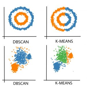
As you can see, if the pattern of the sample points is a little complex, you should go for DBSCAN instead of K-Means clustering. Let us see how you can implement DBSCAN. You can see a more detailed example of this here.
| |
The output will look something like the below:

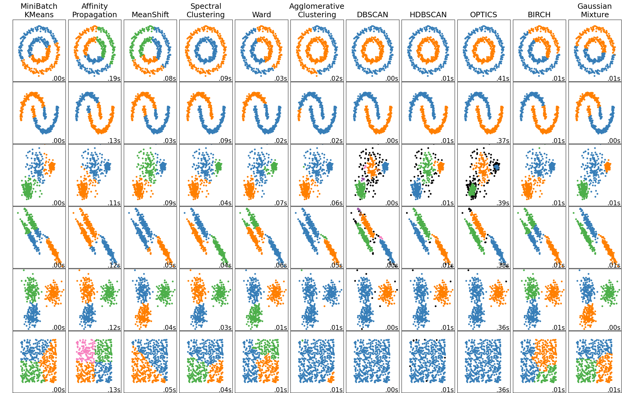
Other Clustering Algorithms
I am just showing you only 2 popular clustering algorithms. But there are a lot more. Each algorithm has its strength and weakness. A comparison and implementation of 10 popular clustering algorithms are shown in the below code. The clustering algorithms used for this code is the following:
- KMeans
- Affinity Propagation
- Mean Shift
- Spectral Clustering
- Ward Clustering
- Agglomerative Clustering
- DBSCAN
- OPTICS
- BIRCH
- Gaussian Mixture
| |
The resulting image is like below:
Dimensionality Reduction
Before understanding the importance of data visualization, let us see 2 scenarios first:
- Suppose you have a dataset with more than 3 attributes and you want to visualize them. How can you do that in a 2D or 3D space? The most obvious answer is to select only 2/3 attributes and visualize using them. You can also create multiple plots each representing 2/3 attributes of the dataset.
- Suppose you have a very dataset with millions of attributes and you want to train a large model (say a neural network) using that data. You find that the training and prediction of the model are very slow and won’t fit your needs. So you can remove some attributes from the dataset and then use them for the model. Now, which attributes will you remove first? What if some of the attributes are more important than others? How do you determine that?
In these scenarios, a dimension reduction will help you a lot. You can create a new dataset from these where the number of attributes is less. You can also get the importance of each attribute in your dataset. Here the importance is derived from how much the dataset is diverse based on that attribute.
There are a lot of algorithms for Dimensionality Reduction. We will discuss only two of these methods: PCA and t-SNE.
Principal Components Analysis
Principal Component Analysis, or PCA, is a dimensionality-reduction method that is often used to reduce the dimensionality of large data sets, by transforming a large set of variables into a smaller one that still contains most of the information in the large set. The main objective of PCA is to reduce the number of variables of a data set while preserving as much information as possible. The steps of PCA is as follows:
- Standardize the Dataset
- Compute the Covariance Matrix
- Compute Eigen Values and Eigen Vectors from Covariance Matrix
- Sort the attributes according to their respecting Eigen Values and select the first required number of columns.
After standardizing the dataset, all the variables will be transformed to the same scale. So the range of an attribute will not apply any effect on PCA. The covariance matrix is a $nxn$ symmetric matrix (where $n$ is the number of dimensions) that has as entries the covariances associated with all possible pairs of the initial variables. For example, for a 3-dimensional data set with 3 variables x, y, and z, the covariance matrix is a $3x3$ matrix of this from:
$$\begin{bmatrix}
Cov(x,x) & Cov(x,y) & Cov(x,z)\
Cov(y,x) & Cov(y,y) & Cov(y,z)\
Cov(z,x) & Cov(z,y) & Cov(z,z)
\end{bmatrix}$$
After getting the covariance matrix, we calculate the eigenvalues and eigenvectors. We are going to have $n$ eigenvalues $\lambda_1, \lambda_2 … \lambda_n$. They are obtained by solving the equation given in the expression below:
$$|A - \lambda I_n| = 0$$
Here $I_n$ is an identity matrix of shape $nxn$. The corresponding eigenvectors $e_1, e_2… e_n$ are obtained by solving the expression below:
$$(A - \lambda_j I_n) e_j = 0$$
Here, we have the difference between the matrix $A$ minus the $j^{th}$ eigenvalue times the Identity matrix, this quantity is then multiplied by the $j^{th}$ eigenvector and set it all equal to zero. This will obtain the eigenvector $e_j$ associated with eigenvalue $\mu_j$.
PCA from scratch
Luckily, NumPy has all the functions to calculate these in one line. Let us implement this in code.
| |
After that, we can create a subset of our attributes and eigenvectors. We can also transform our original data using the eigenvectors.
| |
If we wrap the whole process into a function, the whole code should look something like this. We are applying the algorithm on our well-known Iris dataset taken from sklearn.dataset submodule. Iris has 4 dimensions, we will reduce it to 2 dimensions for visualization in a 2D plot.
| |
The result is quite impressive as we can see three types of plants being partitions into their own spaces. This is the power of PCA.

PCA using sklearn
Now lets see the same in scikit-learn.
| |
DONE. It is just that much simple.
t-SNE
When it comes to Dimensionality Reduction, PCA is famous because it is simple, fast, easy to use, and retains the overall variance of the dataset. Though PCA is great, it does have some drawbacks. One of the major drawbacks of PCA is that it does not retain non-linear variance. This means PCA will not be able to get good results for the dataset when you want to preserve the overall structure of the dataset.
In PCA, the relative distance between two sample points is not maintained, thus the dataset structure is deformed. But using t-SNE, you can reduce the dimension of the dataset preserving the relative distance between each sample point.
t-SNE is a nonlinear dimensionality reduction technique that is well suited for embedding high dimension data into lower dimensional data (2D or 3D) for data visualization using t-Distribution. t-SNE stands for t-distributed Stochastic Neighbor Embedding. Let us break each letter and try to understand them.
- Stochastic: Not definite but random probability
- Neighbor: Concerned only about retaining the variance of neighbor points
- Embedding: Plotting data into lower dimensions
To apply t-SNE, we need to follow these steps:
- Construct a probability distribution on pairs in higher dimensions such that similar objects are assigned a higher probability and dissimilar objects are assigned a lower probability.
- Replicate the same probability distribution on lower dimensions iteratively till the Kullback-Leibler divergence is minimized.
We will not implement any more algorithms from scratch and make this lesson unnecessarily long. So let use t-SNE using scikit-learn.
| |
The visualization part is the same as above. The output of the algorithm on the Iris dataset is given below:

As you can see, the two labels are very close to each other and hard to distinguish. The later label can be very easily separated from the dataset. You do not get this distance between each sample using the PCA algorithm.
One important thing about t-SNE is its perplexity. This single hyperparameter can change the whole transformation of the dataset. The larger the perplexity, the more non-local information will be retained in the dimensionality reduction result.
Let us see the effect of different perplexity values on the IRIS dataset.
| |
The result is given below:

As you can see, the perfect perplexity stays between 30 to 50. Less perplexity pays more attention to the global information and increases the distance of some points from all other points too high. On the other hand, large perplexity pays a lot of attention to local information and tries to keep the distance of points in the same cluster higher than the intercluster distance.
There is also a very popular dimension reduction method. It is based on deep neural networks and is known as AutoEncoders. We will learn this in a later lesson after we cover the basics of Neural Networks.
Some words about Reinforcement Learning
Reinforcement Learning is another type of Machine Learning technique that is neither Supervised Learning nor Unsupervised Learning. Reinforcement learning is the training of machine learning models to make a sequence of decisions. Via this algorithm computers learn to achieve a goal in an uncertain, potentially complex environment. In reinforcement learning, artificial intelligence faces a game-like situation.
Suppose you are in a game environment. At first, you do not even know your goal. You do not what to do, and how to complete the game. Slowly you move forward and see a coin standing in a corner. You proceed to the coin and take it. The moment you pick up the coin, you see your score going up. You know that a higher score is always better. So you decide to take as much coin as possible throughout the game.
Again you see a thorn mounted on a wall. You try to touch that thorn and suddenly see your health go down. Eventually, if you keep touching that, your health will deplete and you will die. After understanding this, you decide to stay away from those for the entire game.
A virtual agent in the algorithm is just like you. He gets a reward in the game when moved towards a goal, and gets punished when moves away from the goal. There is a lot of live competition happening for reinforcement learning. For example, there are Halite.io, crowdanalytix, codalab, ods.ai etc.
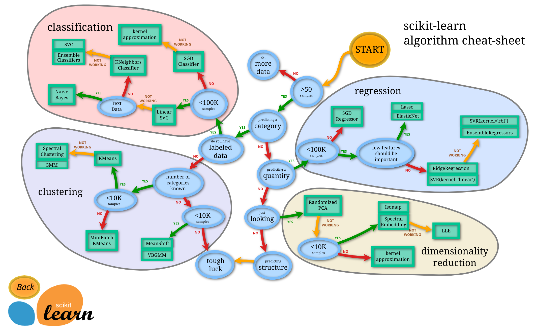
Solving different dataset problems with different approaches
As of the official guide of Scikit-learn, often the hardest part of solving a machine learning problem can be finding the right estimator for the job. Different estimators are better suited for different types of data and different problems.
The flowchart below is designed to give users a bit of a rough guide on how to approach problems concerning which estimators to try on your data.
Conclusion
This lesson is the wrapping up of the Scikit-learn framework in Machine Learning. Now you can be confident that you can get started with both supervised and unsupervised learning algorithms. In a later lesson, when we will learn about deep learning algorithms, you will understand that the basic ideas of these two lessons on scikit-learn still apply. Apply some algorithms to your own needs and share that awesomeness in the discussion section.
